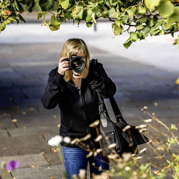
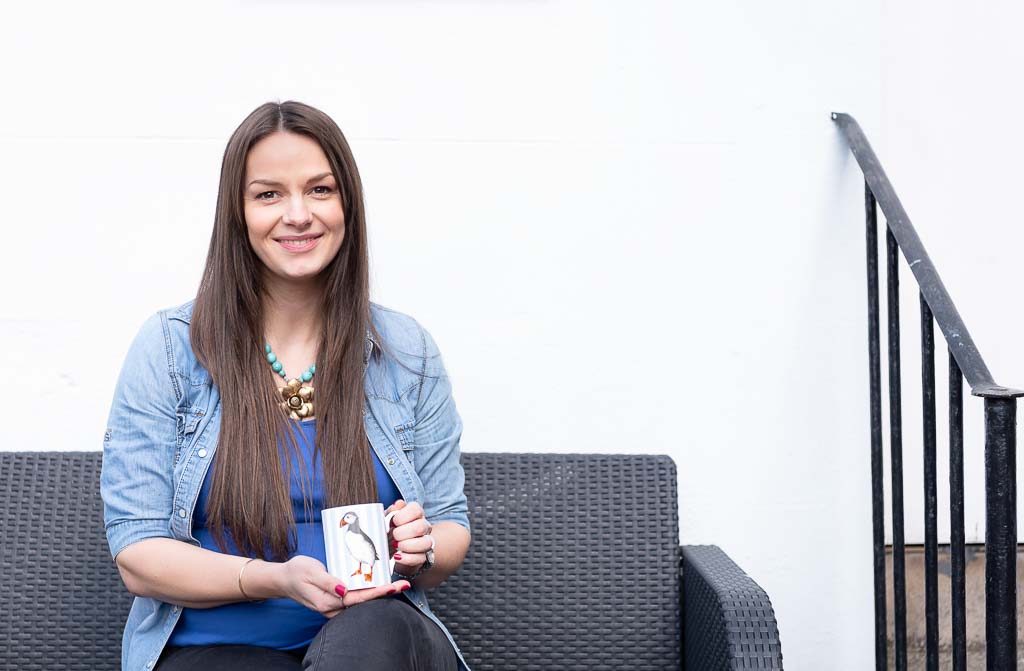
As a personal brand photographer in Edinburgh, I get asked all sorts of questions by all sorts of people.
Following on directly from the matter of consistency in social media photos, the next thing I'm usually asked is how to choose the right editing style for business photographs.
Every time, I think to myself ...
Don't over-cook the broth!
Squinting at the empty Mateus Rose bottle leaning against some mottled apples, I thought it would be a good idea to slap what my Higher Art teacher had told me was "hunter green" paint onto the canvas in front of me.
Then I decided the hunter green looked really weird with that apple's shade of rotten vermillion. So I added (too much) yellow to make the apple a bit warmer, then sighed at how positively chartreuse the bigger apple now looked next to it.

It was the late '80s, okay ..?
I stirred a bit of blue in. "Crap, now it looks like a bloody plum" I sighed, daubing on some more red paint, and getting in more and more of a fankle with every new brush stroke.
It. Was. A. MESS.
An utter mess, with nothing whatsoever glorious about it.

Every painting I produced was an utter mess because I could not decide in advance what I wanted the end result to look like.
Instead, I tinkered and I tampered, trying this, trying that, until I had an ugly, sludgy mess. Completely over-cooked.
Know when to stop
And I was pretty GOOD at art!
Somehow I got an A for Higher (must have been my drawing), despite not knowing at the time how on earth to build up colours in a picture. And DEFINITELY not knowing when to stop cooking the broth.
I never knew when to stop.
Years later I took up a camera in favour of paint brushes, and when I edit my photographs now I think back to those godawful messes I made in the art department. And mutter to myself "begin with the end in mind, and don't over-cook the broth, don't over-cook the broth".
It's SO easy for us to make a complete mess of editing our own photographs for our social media business profiles - I see it everywhere.
People just throw paint at the wall, plastering on this effect, that effect, a wee bit of this filter, a big bit of that colourisation, oooh let's whack the sharpness a bit ... or a lot ... And how about that filter on top of the first one?
Don't do it!
In my last post I told you why consistency in social media photos is so crucial, and now I'm going to tell you how to achieve it.

Don't overdo all the effects you put on your social media photos or you'll end up with an overcooked image!
How to edit your photos consistently
1) Your audience - what do you need them to think and feel?
It’s so easy to forget that it’s not just about what YOU like in terms of photos and images.
You need to figure out how your ideal client would think and feel when SHE sees them.
Because the bottom line is, your images need to appeal to your ideal client and help you make a connection with her. Really, there’s no point in posting anything if you don’t keep this aim at the top of your mind at all times.
Here are a few things to consider when thinking about how to build your brand’s visual identity and deciding what style of imagery your ideal client will respond positively to.
Bear in mind these are generalisations, but still, they all need to be factored into your decision-making process when you’re figuring out how to pull together a consistent aesthetic in the business photos you post online.
By considering your ideal client and taking the time to think about her preferences, you can take, edit, and curate photos that will help you make a connection with her and make a lasting impression.
2) Subject matter - what will you show?
Know what you want people to think and feel about you, and bear in mind your brand's personality, values, and mission. All that stuff. It really does help in choosing photos which align with your brand's messages.
Certain photos are mandatory to help you sell your services - make sure you post photos regularly of your products or services in action. You need to give your followers a good understanding of what you do and how you can help them.
Don't forget the "behind the scenes" images
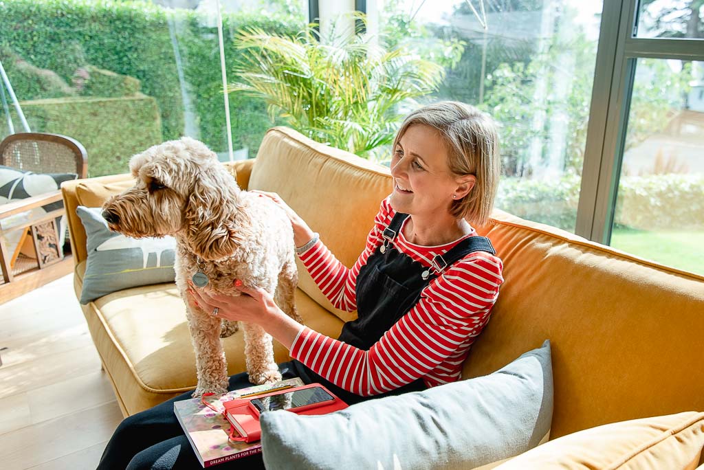
Show behind-the-scenes shots (this is something I keep forgetting to do!) … Folks are nosy so we love getting wee glimpses into what goes on behind the scenes both in your business and in your life! Consider sharing photos of you and/or your team in action, your products in use, your workspace, or events you go to or host.
You can share photos of your clients or customers using your products or services, or even show just them being in your presence, alongside you. This shows that you value them and will help build trust and rapport with others you have yet to book.

Keep it real: folks are drawn to “realness” and honesty, so don't be afraid to show the unfiltered side of your brand. How about sharing photos that show the challenges and obstacles you face, or even just a behind-the-scenes look at your daily life?
Keep it on brand and don't confuse
Try at all times to choose photos which accurately represent your brand and engage your followers.
Don't be afraid to experiment and see what resonates with your audience, because sometimes you might be surprised by the results.
I post quite a lot of pictures of landscapes of home, the highlands and islands of Scotland, and they go down really well on my social media. Even though I never photograph landscapes commercially - they’ve got nothing to do with my brand photography business, which is primarily for female business owners and entrepreneurs in Edinburgh and across Scotland!
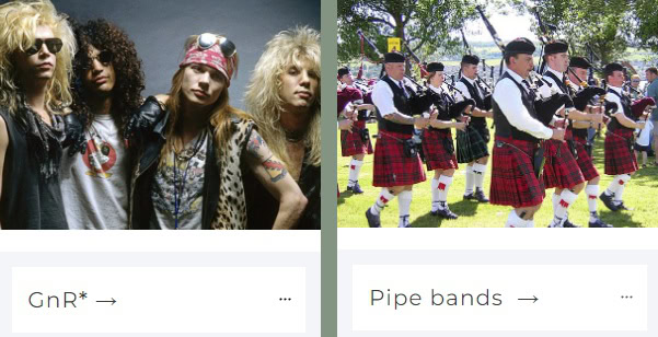
And I don’t post pictures of other stuff I’m into, like pipe bands, Guns ‘n’ Roses, and historical fiction books.
That would be hugely confusing (and let’s face it, probably dead boring) for my audience, unless you find it on my about page. And it would really muddy my messaging.
If you’re going to show images of what you get up to outwith your business - and I absolutely recommend you do - just don’t show too many different things too often, or it’ll really confuse people.
3) Colours - what do they say about you?
Deciding on the colour palette you'll use is massive when deciding how to choose the right editing style. It might might be something you’ve never thought about before, and you may wonder why it matters when there are a gazillion colours in the world - and most of them seem to end up in your photos!
But it absolutely does matter. The colours you use can make a big impact on your personal brand by influencing what people subconsciously think when they see your stuff (<-- technical term).
According to a study performed by the University of Loyola, Maryland, “[c]olor increases brand recognition by up to 80 percent.”
That’s a pretty high number, isn’t it?
Snap decision-making
Additional research showed that colour has a significant impact on sales since “people make a subconscious judgement about a . . . product within 90 seconds of initial viewing and . . . between 62% and 90% of that assessment is based on colour alone.”
That’s huge! Really huge!
Make no mistake, colour plays a crucial role in creating and maintaining a strong brand, and it sure as heck influences how your clients perceive your business.
Colour psychology
Hopefully you’ll have chosen your main brand colours with colour psychology in mind (try the colour generator half way down this page by the way - it’s brilliant).
If your business is all about creativity and innovation, you may have gone for a bright, vibrant colour like yellow. On the other hand, if your business is more focused on stability and reliability, you might have picked a solid, dependable colour like navy blue.
The secondary colour should complement your main brand colour and create a harmonious balance.

For example, if your main brand colour is yellow (boak - sorry), a good secondary colour might be green. The two colours together create a cheerful and energetic vibe.
Or if your main colour is navy, you might like a wee splash of fuschia to lighten things up a bit and introduce a less formal feel.
Remember, it's personal
However. And this is a pretty big “however” …
The meanings attributed to colour are often too dependent on personal experiences to mean the same thing to everyone.
Personal preferences, experiences, upbringings, cultural differences, and context make it REALLY hard to state with certainty that X colour = Y perception.
I mean, I hate yellow. I really, really detest the colour yellow. Except in daffodils. And lemons - maybe. But I don’t like it in primroses. Or dandelions. Or most other places to be honest.
You might bring out the negatives
So what I said above about picking yellow to convey creativity and innovation? You’ve just lost me, because for me yellow brings Burger King, McDonalds, and dandelions instantly to mind. And sorry Ronald, but none of those things give me happy thoughts!
But, we need a starting point, don’t we … Just bear in mind that the concept of X colour eliciting Y perception in Z type of person will always throw the odd exception.
The importance of context
It’s also worthwhile at least considering contextual “norm” where colour’s concerned. Some colours in some contexts just do not work.
Imagine you were selling kids' journals and they were all black, white, beige, brown, grey … Or, imagine you were selling high end couches and chairs - in the colours you’d normally find in a toy shop.
You COULD go against these grains, but you’d have to pull some other pretty clever stuff out of the bag to make it work.
Age, gender, and cultural differences
As well as context, the general age of your viewers can count - younger people might respond better to brighter, more vibrant colours, while older people might prefer more muted, sophisticated tones.
Have a think too about how men and women might respond differently to certain colours - there’s a good article here on common differences.
Folks of different cultures sometimes respond differently to certain colours too, so think about what culture your ideal client belongs to - read this article to see what different colours mean in different cultures.
Get the right hue
Whatever colours you’ve gone for, staying as consistent as possible in their hues makes your “look” even stronger. This can be pretty tricky to do but it pays off.
What am I on about?
Well if your main brand colour is a kind of olive green, try to stick to olive green when green appears in your photos - moving away to a limey, bilious green one minute then a rich racing green really dilutes your efforts to be consistent.
Use your brand colours
Where possible in your photographs, use your main and secondary brand colours - and that goes for your headshots, lifestyle images, and any detail or product shots.
You can use your colours in subtle ways, such as incorporating them into your clothing or backgrounds, or in bolder ways, like weaving your brand colours through your props or accessories.
You don't have to include all the colours you’ve picked out in every photo all the time, but if you try to include two in each image, that’s going to go a long way towards maintaining a consistent visual style.
What to do if you don't see any of your brand colours
But what if you're faced with a scene that doesn't have any of the colours from your chosen palette?
Try really hard to squeeze one in and make it reasonably dominant in the frame, if you can. Then even if the rest of the scene in the image doesn’t include the colours you’d like, at least you’ll still have that one strand of colour tying all your images together.
If it’s just not going to work, firstly ask yourself if you REALLY need to post that photo. If you do, you do. These are guidelines, not rules to be shackled to.
Colour influences perception
The colours you use in your personal branding photography can have a huge impact on how your clients perceive your business, so you really need to make the most of the opportunity of getting these colours in your photos wherever you can.
It’s important to remember that all colours can elicit positive AND negative feelings, but whichever ones you pick, stick to them where you can.
4) Brightness and contrast - high key or low key?
If your photos are too dark or too bright, just use the brightness and contrast tools in your editing app to correct this. Just be careful not to over-do it, as you don't want overcook things and end up with an image that looks freakily unnatural or over-processed.
You also need to make sure that the brightness and contrast are consistent across all of your photos - remember, you’re going for a cohesive look for your personal brand.
Will you go for high key or low key photographs, or somewhere in the middle? They’re pretty different styles and say different things about a person and/or business.
a) High key photography
This is usually characterised by bright and airy images which have a lot of white space in them, and high levels of exposure, or “lightness”.
The lighting can be pretty soft, often diffuse, and the background is usually white or light-coloured, which really makes the subject stand out.
High key photography is often used in fashion, beauty, and lifestyle photography to showcase a person's personality and style - think portraits with a lot of white space around the person, and images shot against a white background or a well-lit environment.
The intention of images like this is to convey a positive, uplifting, energetic vibe.
b) Low key photography
Low key photography, on the other hand, is characterised by darker and moodier images, with high contrast and deep shadows. The lighting is typically dramatic, with the person often lit from one side, creating strong shadows.
The background is usually dark or black, making the subject stand out even more. Shadows are usually very, very dark, so the eye is drawn to whatever's highlighted, and all that darkness becomes what's often termed "white space".
Low key photography is often used to suggest a person's power, authority, or expertise, and the intention is to create a more serious and intense mood.

Where and when you take your photographs can come into play here.
For example, if you take them in winter in a north-facing basement flat in the New Town in Edinburgh, you may find it a wee bit trickier to achieve a high key look than if you lived somewhere very hot and bright, like, say, Spain or Mexico. Scotland (particularly in winter!) has very different light to places like that, so just be aware is all!
5) Colour temperature - warm or cool?
Again, what do you want people to think and feel when they see your images?
Warm toned photographs have a yellow, orange, or red hue to them, and they tend to evoke feelings of comfort, happiness, and warmth. These colours are associated with the sun, so they naturally make people feel more relaxed and at ease.
If you're looking to showcase yourself and your business as friendly, approachable, and warm, then warm toned photos are a great option for you. For example, if you're a life coach or a therapist, a warm toned headshot with a yellow or orange background can help people feel comfortable and at ease when they see your photo.
On the other hand, cool toned photographs have a blue, green, or purple hue to them, and they tend to evoke feelings of professionalism, trustworthiness, and authority. These colours are often associated with the sky and water, which are both calming and serene.
If you're looking to showcase a more professional, serious, and authoritative personality, then cool toned photos are a great option for you.
If you're a lawyer, doctor, business coach, or CEO, a cooler toned headshot with a blue or green background can help people feel confident and trust in your expertise when they see your photo.
6) Filters - (where) will you use them?
The easiest, most basic way to edit your images is by using filters. You’re probably familiar with filters on Instagram and the likes - they’re dead easy to use (and abuse!).
You can branch out from Instagram though - try apps like Snapseed, my favourite photo editing phone app (Android version here, Apple version here), or Lightroom, as they offer a wide range of filters (aka presets or styles) which you can then tinker about with to your heart’s content and adjust to suit yourself.
Some people are quite snobbish about filters and reckon they’re for kids on Snapchat, but there’s no doubt they can help you to achieve a certain mood or tone in your photos. They can also help to correct colour weirdness or other defects with your photos - pretty quickly, too.
Stay on brand!
When it comes to choosing the right filter, just make sure you pick one that fits your brand - and stick with it as often as possible.
If you have a bright and colourful brand aesthetic, then you might want to choose a filter that enhances the colours in your photos.
On the other hand, if you have a more muted and moody brand look, then you might want to choose a filter that tones down colours and adds a bit of contrast.
Just don’t use one filter one day, then something completely different the next, then oh why not, lets try that one the next … But wait, there’s the perfect filter for Saturday! There’s no faster way to make your image collection look like a complete mess.
Stick with just one or two filters. No more.
7) The natural look - or highly stylised?
The choice between posting natural looking or highly stylised photographs on social media - like everything else I’m talking about in here - definitely influences the way people perceive your brand and even the way your target audience engages with your content.
Both types of photos have their own benefits and drawbacks, and ultimately it depends on the perception you’re trying to create in people’s heads.
The natural look
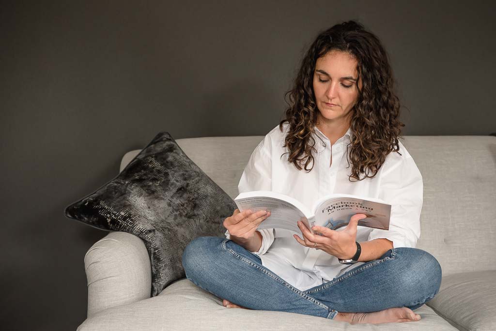
Natural looking photographs, such as candid phone snaps or everyday images, make you look real and genuine. Photos like this can help to humanise your brand and make it feel approachable, helping build trust with your audience.
On the other hand, highly stylised photographs, such as obviously artificially lit and heavily images can elevate the visual appeal and sophistication of your brand. These types of images can help to showcase your products or services in their best light, and can be particularly effective if your brand has a premium or luxury focus.
Stay on brand!
However, it’s important to ensure that the stylisation remains in line with the overall aesthetic and tone of your brand, otherwise it may come across as fake or contrived.
The decision between going for natural looking and highly stylised photographs ultimately comes down to your brand’s goals and target audience.
If your brand is focused on building a strong connection and rapport with your followers, then a more natural approach may be the better choice.

However, if you want to showcase the high quality and premium nature of your products or services, then a more stylised - although often more impersonal - approach may be more effective.
So really, as ever, the decision between natural looking and highly stylised photographs on social media ultimately depends on your brand’s goals and target audience.
(Bored of me saying that yet??)
8) Vibrant and colourful - or muted and matte?
What will you go for? As with everything else I’ve gone on about here, it all depends on what you want your images to say about you and your business. (You’re definitely bored of hearing that now! But you’ll have the message, yes?)
What your product or service actually IS will be a factor in whether you decide to edit on the bright and vibrant side or the dark and muddy side - or somewhere in the middle.
Bright and fun
Using vibrant, highly saturated bright colours in your photos can give them a fun, energetic, and positive feel, making you and your business appear approachable, creative, and lively.

People tend to associate bright colours with excitement, joy, and innovation, so you’ll attract followers who, well, are attracted to that vibe.
There’s a spectrum of intensity though, and if your images are at the top end where all the colours are cranked up to max, there’s a danger your images will appear chaotic and/or cheap.
One way around this could be to have a small pop of bright colour in each image, fairly small in the frame so it doesn’t smack viewers between the eyes too hard.
Muted and dark
On the other hand, using muted, matted, dull, dark coloured images can give off a more serious, professional, and sometimes sophisticated vibe, making you appear reliable, trustworthy, and competent.
People tend to associate darker colours with stability, security, and strength, which is why you’ll see many law firms, banks, and other professional (often non-creative) organisations use darker colour tones.
Take the dark mutedness (is that a word??) too far, though, and your images could look dull, moody-in-bad-way, and depressing, making you appear closed off and unapproachable.
9) Text overlays - what fonts and what sizes?
Fonts are kind out of my wheelhouse, and there is no way in hell I am going to stray into the typography expert’s domain here! That’s an immensely specialised subject which kind of scares me, it can be so complex.
So let’s just move swiftly on and say you’ve picked the perfect fonts for your small business brand.
And sometimes you’re going to want to overlay words in those fonts on images.
Combining photos with text overlays is a real balancing act, and if you want the finished image to look good and achieve any kind of visual harmony, there are a few things to think about.
Be careful
You can’t just slap any old text on top of an image any old how. (Sorry about that!)
Place your words strategically in the image - don’t just bung it in the centre. Does the composition of the photograph lead the eye to a natural looking place that text would work well? Is there a large part of relatively undetailed space in the image that looks a natural place for text to sit?
If there’s a person in the photo looking in a certain direction, can you place the text as if the person’s looking directly at it?
Wherever you put the words, make sure there’s contrast in colour, contrast, and/or brightness between the image and the text - this hugely increases legibility.
Good ways to make text overlays legible
A common go-to is placing lighter text over a darker image, or vice versa.
Or you can use completely contrasting colours, like overlaying blue text on an expanse of orange in an image. (Just be aware that if you’re using colour to make the words pop, there could be accessibility issues, so best gen up on that.)
Blurring the image a bit, particularly if it’s busy looking, can work too. Having nice sharp text over a blurred image makes the words easier to read - if it’s appropriate to allow the image to be blurred, of course.
Making the weight of the text contrast with the image can also be a good tactic. Bold, heavyweight text will draw attention instantly, particularly if it’s laid over a paler, lighter image, but the converse also works. A thin “light” font, where more of the image is visible, can make a big impact if the image is heavy and bold looking.
What next?
I’m pretty sure you’ve got my point that building your brand's visual identity through photo editing is a key factor in establishing a strong and consistent visual aesthetic for your audience.
Whether you’re showcasing products or services, or simply getting yourself out there as an individual, the right photo editing style you adopt can make or break how people respond to your marketing efforts.
But keep in mind that photo editing is a complex process, and can be challenging if you are not familiar with the tools and techniques involved. And even with the best tools and techniques, achieving a professional-looking result can still be difficult if you don't have an eye for detail.
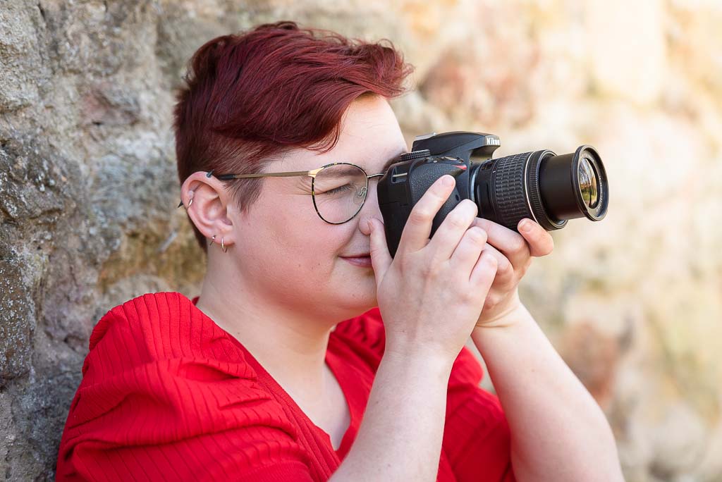
This is where hiring a professional personal branding photographer can make all the difference.

A professional brand photographer will have the skills, experience, and eye for detail to create stunning images that truly reflect your brand's personality and values. And these images help you make more money.
Not only will someone like me help you choose an editing style that is best for your brand, but we’ll also take care of all the technical aspects of the process, making sure you get the best possible results.
Whether your business has been established for ages or you’re just starting out, investing in high-quality photos is a necessary investment in your brand's future.
Searching for a brand photographer in Edinburgh or Fife (or anywhere else in Scotland)?
Do you want to:
- Get more of the right clients so you can grow your business?
- Create a dynamic online presence to be proud of which makes people hire you?
- Position yourself as the best - the ONLY - choice in the area for your ideal client?
Oh good! Get in touch to discuss how professional business photographs help grow your business - this is no time for DIY'ing it. Let's make you look the expert you are.
⠀
Drop me an email today or book a call so we can chat about what this would look like for you!