Please, for the love of your future photos, stop wearing black
I wore black for most of my adult life.
It was my safety blanket, my professional armour, and my fallback when nothing else felt right. And like so many of my clients, I believed it was the safest, most flattering option – especially when I was nervous about being seen.
So, I understand the reliance on black. I really do.
But if you’re planning brand photos, black is not your friend.
I’m not saying this to be dramatic (although, ironically, black is pretty dramatic). I’m saying it because my job – my actual job – is to help you be seen clearly, warmly, and in a way that connects. And black makes that significantly harder than it needs to be.
Let me explain.
Black: the visual equivalent of a disappearing act
In real life, black is the wardrobe equivalent of a security blanket. On camera, it’s more like a black hole.
It swallows light. It flattens shape. It turns all your lovely textures and layers into one big shadowy blob. Unless the lighting is professionally finetuned (and by finetuned, I mean borderline surgical), what shows up is usually… your head. And maybe your hands. If you’re lucky.
This isn’t about fashion rules or what looks good on the Zara app. It’s about what works in photographs – especially strategic ones designed to showcase your energy, personality, and professionalism.
Black absorbs everything around it, including your features. Necks vanish. Jawlines blur. Harsh shadows exaggerate lines that didn’t even exist when you left the house. And the overall vibe? Often more “stern Victorian headmistress” than “warm, brilliant business owner you can’t wait to hire.”
For most of my clients – especially those who are already a bit visibility-averse – this does exactly the opposite of what we want your brand photography to do.
We’re not here to blend in. We’re here to be seen.

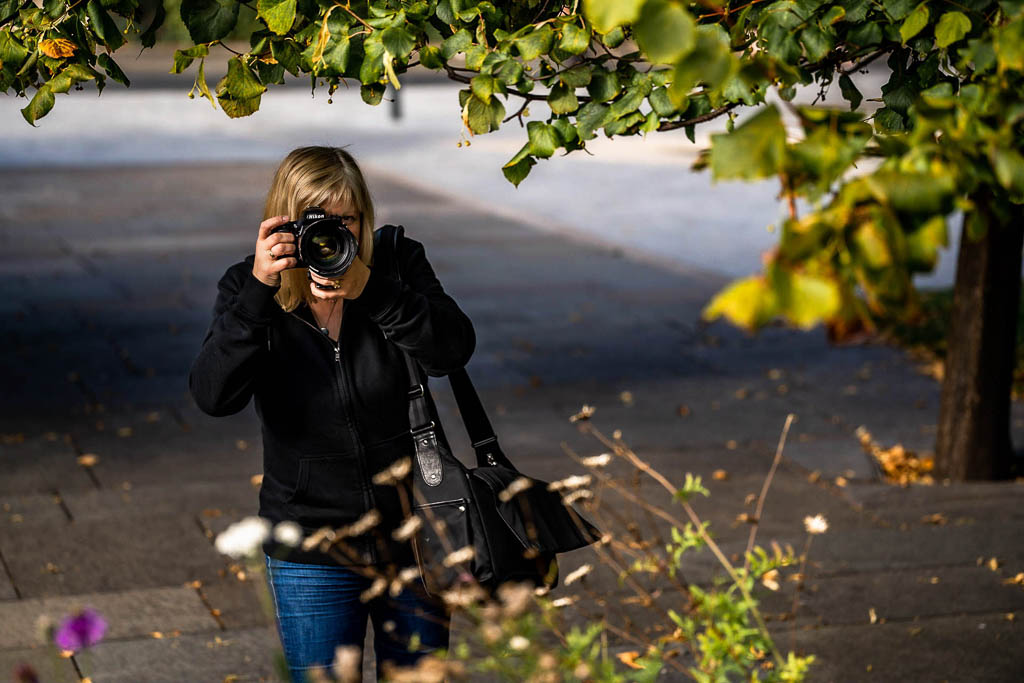
Me, hiding very successfully in black - before I knew better!
But it’s safe! (I know. I wore it too.)
There’s something about black that feels like protection. It’s the sartorial equivalent of invisibility. Sharp, simple, no-nonsense.
You can’t go wrong, right?
Except… you sort of can. And not because you’ve done anything “wrong” – but because what black often protects us from is being seen.
I see this all the time with clients who are thoughtful, considered, sometimes a bit camera-shy. (So, almost all of them. Including me.) The ones who quietly dread the idea of standing in front of a camera and saying, “Here I am. This is my work. This is what I believe in.” When visibility feels vulnerable, black feels like armour. And I do understand that.
I wore it for decades. It was my default for every photo, every event, every “not sure what to wear so I’ll just disappear slightly” situation. Until I went for a colour analysis session with my daughter and discovered I looked like I’d had a nap and a facial just by swapping fabric swatches, I had absolutely no idea how much of myself I’d been hiding under those layers of Very Serious Black.
It wasn’t vanity. It was caution. Safety. Strategy, even.
But it was also a tiny betrayal of what I was trying to do.
Because I wasn’t dressing to be seen. I was dressing to survive the experience of being seen. Ugh!
And that’s the shift I want for you, too – not to feel scolded for wearing black, but to feel supported in moving beyond it.
You’re not doing it wrong. You’re doing what most of us have been taught to do: play it safe, don’t take up too much visual space, blend in. But blending in doesn’t build your brand, does it? Visibility does.
When black can work – with caveats
I’m not here to launch a crusade against your entire wardrobe. Black isn’t banned. It just needs backup.
If you’ve got high-contrast, cool-toned colouring – think Snow White: porcelain skin, dark hair, bright eyes – black can work near your face if the lighting has surgical precision. But even then, it’s rarely the best option on camera.
There are a few ways to make black less of a mood-killer in photographs:
- Add contrast: A scarf, necklace, or jacket in a brighter colour can stop the black from swallowing your features.
- Choose texture or pattern: A black top with texture or a bold print helps break up the visual monotony and gives the camera something to work with.
- Balance it out: If the black’s on your bottom half and you’ve got something lighter or more colourful near your face, it can still work. (In fact, some of my clients' favourite looks involve black trousers paired with vibrant tops or bright jackets.)
You don’t need to throw your entire wardrobe into the sea. But if black is your default, it’s worth asking whether it’s doing your brand photos any favours. (It probably isn’t.)
Even when it does “work,” it tends to work a bit against you. And for photos where you want to show warmth, energy, and a sense of who you are – you want your outfit working with you.
So what should I wear instead?
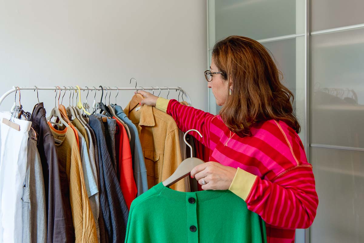
You don’t need to turn up looking like a Pantone fan on a sugar high. But you do need some colour near your face. Something that reflects light, shows texture, and brings a bit of life to the image.
The best colours are the ones that make your skin look fresh, your eyes sparkle, and your personality show up before you even speak. If you’ve never had a colour analysis, this can sound suspiciously like witchcraft – but it’s not. It’s just science, shadows, and undertones. And the effect can be genuinely dramatic.
If you’re not ready to book a full colour analysis (though I highly recommend it), here are a few rules of thumb that work well for most people:
- Avoid stark contrasts unless you know you suit them. Swap bright white and deep black for softer alternatives – ivory, stone, navy, charcoal, or deep moss green.
- Look for colours that echo your natural tones. If you’ve got warmth in your skin, try soft peach, warm rust, or olive green. If you’re cooler-toned, try berry shades, charcoal, or deep teal.
- Wear your brand colours if they suit you. If they don’t, and boy do I sympathise as I look like a walking corpse in my brand greens, you can still bring them in as accents – jewellery, props, backgrounds – and wear what makes you look alive.
And then there’s texture. Soft knits, linen, gentle folds and layers – anything with surface detail will add depth to the photograph and stop you looking like a floating head attached to a plank. Avoid shiny, stretchy fabrics (yes, that includes satin-effect blouses) and opt for matt finishes instead.
If you're planning a shoot right now, bookmark my post on what to wear for a brand photoshoot – it’s full of tips that’ll stop you panic-buying something wildly unsuitable the night before.
And if you’re interested in making your brand photos feel like a natural extension of your business, take a look at my guide to wearing your brand colours in your photoshoot. It’ll help you figure out which colours support your visual identity without turning up dressed like your logo designer exploded.
You don’t have to go full rainbow. But a deep green, a warm rust, a soft blue – something that complements your tone and lifts your features – will always do more for your photos (and your confidence) than flat black.
Even something as simple as swapping a black top for a navy one can make a real difference. It’s about showing up on purpose – not just on autopilot.

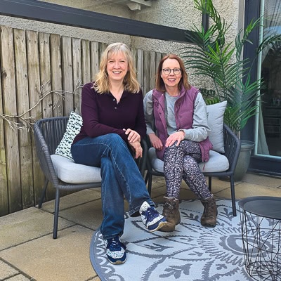
Me on the left more recently, substituting black with aubergine. You absolutely don't need to go too vibrant if that's just not you!
Your clients want to see you, not your sleeves
When we get down to it, brand photography isn’t about clothes. It’s about clarity.
Your audience isn’t here to admire your cardigan. They’re here to understand who you are, what you do, and why they should trust you to do it. The job of your outfit – especially the one you choose for your brand photos – is to support that clarity, not smother it under layers of apologetic black.
This doesn’t mean performing a personality transplant through your wardrobe. It means choosing clothes that help you show up as you actually are – warm, thoughtful, professional, human.
Wearing black often signals a desire to retreat. In real life, that might feel comforting. But in photographs, it usually just looks like you’ve half-disappeared and aren’t thrilled to be there.
And let’s be honest – if you’ve invested in strategic brand photography, it’s because you’re ready to be more visible. Not in an all-singing, all-dancing, “Hey, look at me!” way. But in a grounded, confident, “This is who I am and here’s how I can help” way.
That’s the version of you your clients want to meet. Clearly, kindly, and without your outfit whispering “Don’t look at me” from behind the seams.
Let’s make sure your wardrobe supports your brand
This is one of the first things I help clients figure out during the planning stage. We don’t wing it. We plan it – gently, strategically, and with absolutely zero neon unless you’re specifically into that.
If you’ve booked a shoot (or are even just thinking about it), and the idea of choosing what to wear feels like a block, you’re not alone. This is the exact point where so many people freeze. It’s not just an outfit – it’s visibility. And that can feel huge.
But you don’t have to figure it all out yourself.
I help every client prepare for their shoot with advice tailored to their brand, their goals, and yes – their skin tone. We’ll talk through what works on camera, what feels like you, and how to bring personality into the frame without disappearing into it.
If you’re thinking about a brand shoot but feeling unsure where to start – or what on earth you’d wear – I’d be very happy to talk it through with you.
No pressure, no pitch. Just a wee chat about what’s possible, and how I can help you feel clear, prepared- and absolutely not dressed like a floating head!
Book a no obligation call with me here - I'd love to speak with you.

FAQs about wearing black in brand photos
Many people default to black without thinking twice – it’s familiar, it’s safe, and it goes with everything. But when it comes to brand photography, not everything that works in real life works on camera. These FAQs cover some of the most common wardrobe worries clients have.
What if I feel most confident in black?
You can still wear black if it genuinely makes you feel like you, but it’s important to style it intentionally. Add contrast near your face using a scarf, necklace, or jacket in a colour that lifts your skin tone. For more suggestions, see my post on what to wear for a brand photoshoot.
Is there a best colour to wear for brand photos?
There’s no single “best” colour. The right choice depends on your skin tone, brand palette, and the impression you want to make. I share ideas in what to wear for a brand photoshoot and go deeper into tone and palette in wearing your brand colours in your photoshoot.
Do I need to have a colour analysis before my shoot?
Not at all. It can be fun, but it’s definitely not essential. I’ll give you practical styling advice based on what photographs well and what suits you. If you’d like to nerd out further, this guide to colour theory in photography from WhiteWall is a good read.
Are there colours I should avoid apart from black?
Yes – shiny fabrics, bright neons, and stark white can all cause issues in certain lighting. Stick to matt finishes and colours that complement your skin tone. See my what to wear for a brand photoshoot guide for more texture and fabric tips.
Can black clothing ever work in a brand shoot?
It can – as long as it’s styled with care. Look for texture, pattern, or accessories to stop it flattening your features. I show real examples of how clients have done this well in my wearing your brand colours in your photoshoot post.
Will I get help choosing outfits?
Yes. Outfit planning is built into every shoot I do. We’ll talk through what works on camera and what feels like you. You can learn more about the full prep process in my Ultimate Guide to Brand Photography and Business Headshots in Scotland.


