Wearing your brand colours
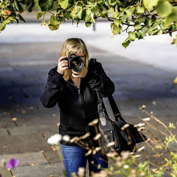
Choosing what to wear for your brand photos might seem like a small decision – but if you’ve ever found yourself staring blankly at your wardrobe the night before a shoot (or even a Zoom call), you’ll know it’s rarely that simple.
One of the questions I’m asked most often by my clients is this: “Do I need to wear my brand colours?” And the short answer is – not necessarily. But can it help? Oh heck yes, absolutely.
Wearing your brand colours isn’t about being matchy-matchy (ugh!) with your logo or dressing in a way that feels forced. It’s about visual consistency, yes – but more than that, it’s about feeling rooted in who you are and what your business stands for. When the colours you wear reflect the energy of your brand, it creates a subtle, powerful sense of alignment. And that doesn’t just impact how others see you – it impacts how you feel when you show up.
In this post, I’m talking about why your brand colours matter more than you might think, how to use them thoughtfully (without feeling like you’ve joined a uniformed cult), and when to let go of the rules altogether.
For even more support on planning your shoot, take a look at my free brand photography shoot planner – it’s a quick and easy way to start thinking strategically about what you want your photos to say.
What your brand colours actually do
When you think about your brand colours, you might think of them as just a visual preference – colours you happen to like, or shades your graphic designer suggested. But they actually carry more weight than that.
Brand colours aren’t just about aesthetics. They’re a cue. A signal. A shorthand way of helping people understand who you are, what you’re about, and how your business feels to engage with.
Colour affects us emotionally and psychologically before we’ve even registered it. Blue often conveys trust and calm. Green can suggest growth, grounding, or natural simplicity. Yellows can feel joyful and optimistic. Deep neutrals feel classic and intentional. It’s not about rigid rules – it’s about resonance. If you’re curious about the emotional impact of colour, this guide on colour meaning and psychology from Canva gives a helpful overview of how different shades influence how we feel.
When you use your brand colours consistently – on your website, in your visuals, across your content – people start to associate those colours with you. They build recognition, familiarity, and trust over time. And if you wear them? Even better. You’re reinforcing that sense of coherence and direction without saying a word.
It’s not about dressing like a colour wheel. But it is about helping your audience feel like they’re in the right place, with someone who’s confident, consistent, and considered.
If you’d like help thinking through outfits, props, locations, and how all of it fits into your wider marketing, my Brand Photo Starter Kit walks you through the planning in a calm, structured way.
If you’re still shaping your overall approach to visual identity, you might find my Ultimate Guide to Brand Photography and Business Headshots a useful companion piece to this post so have a wee read.
Why wearing your brand colours works
There’s something quietly powerful about stepping into a space, whether that’s a brand photoshoot, a Zoom room, or a real-life meeting, and looking already aligned with your brand. When your clothing reflects the same energy as your online presence, it reinforces your professionalism in a way that feels calm, clear, and intentional.
This isn’t about being overly styled or curated. It’s about wearing something that feels like you, while also gently reinforcing what you stand for. Think of it as visual shorthand. A way of helping people connect the dots between who they’re seeing and what they’ve seen from you online.
It’s also surprisingly self-assurance-boosting. (That’s not technically a word, but you get the idea, ha!)
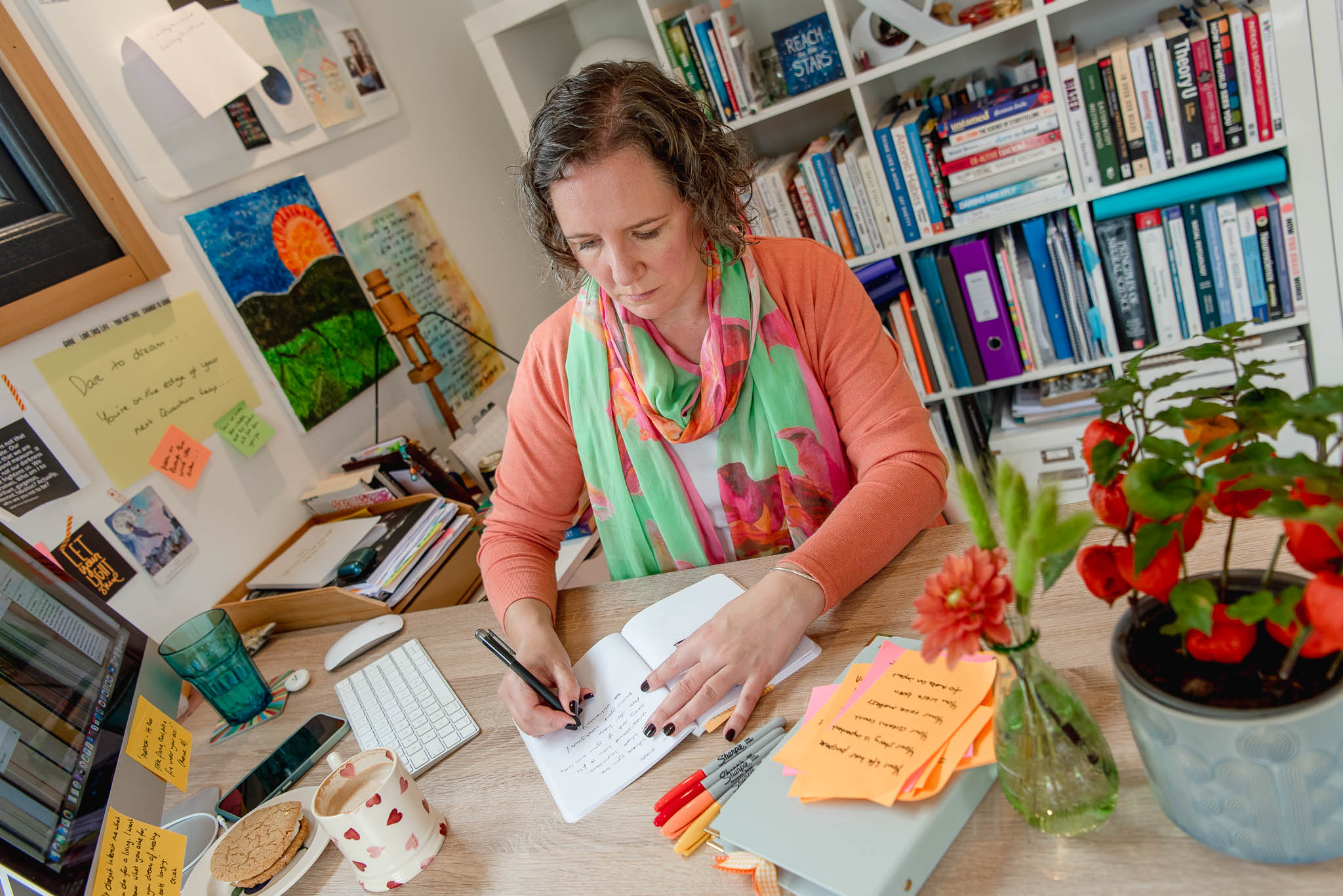
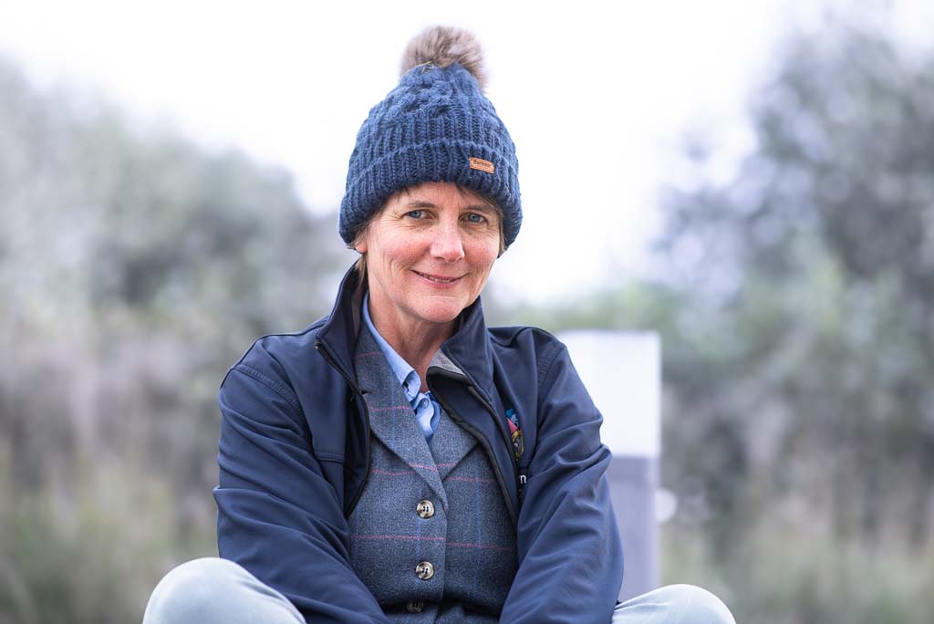
I’ve worked with many clients who’ve felt more at ease the moment they put on a colour that resonated with their brand. One coach I photographed recently said she hadn’t realised how differently she carried herself in her favourite deep green jumper – a colour that happens to be at the heart of her visual identity. “I feel like I’ve already stepped into the person I want to be,” she told me.
And on the flip side? I’ve also seen what happens when someone wears colours that jar with their brand personality. One client – usually thoughtful, soft-spoken, and composed – turned up in a bold neon orange shirt she wasn’t quite sure about. She looked incredible, but confessed afterwards that she’d felt out of sorts and distracted all day. “It just didn’t feel like me,” she said.
The truth is, when you wear colours that do feel like you – and feel like your business – it shows. In your posture. In your expressions. And in how easily you settle into the session.
If this is something you're starting to think about, my Soar package is designed for business owners ready to create a strategic, personality-led collection of images – with brand colour styling fully supported in the planning process.
And if you want a quick refresher or smaller-scale shoot, my Elevate package offers a short, focused option that still makes space for colour-led consistency.
Real-life applications: when to wear your brand colours
Wearing your brand colours isn’t just helpful for a photoshoot – although that’s certainly a brilliant place to start. There are lots of everyday moments in your business where bringing your brand palette into what you wear can help you feel more aligned, more composed, and more recognisable.
Think about your first meeting with a new client. If they’ve already seen your website, your Instagram, your LinkedIn profile – all featuring a certain visual tone – there’s something quietly reassuring about seeing that same tone reflected in how you show up. It helps them feel like they’re in the right place. That the person they’re meeting is the same person they’ve already started to trust.
Wearing your brand colours in these moments doesn’t have to be overt or overthought. It could be a blouse in a familiar shade, a notebook or pen that echoes your palette, or a favourite pair of earrings in one of your accent colours. Even a lipstick or scarf can act as a visual anchor – something that makes the connection click into place.
It’s not about being “on brand” in a forced or rigid way. It’s about consistency. A visual through-line that shows up across your platforms and into the room – whether that’s a real room or a virtual one.
That kind of consistency builds familiarity, and familiarity builds trust. If you’re planning a shoot and not sure where to begin with clothing, my blog post on what to wear for a brand photoshoot walks you through outfit choices, layers, and colour tips to help you feel confident and photo-ready.
And for a deeper dive into how your images can support your brand across every touchpoint, you might like my Ultimate Guide to Brand Photography and Business Headshots.
When not to worry about it
Let’s be clear: wearing your brand colours isn’t a rulebook. It’s a tool. And like any tool, you get to decide when (and if) to use it.
I know this first-hand. Not long ago my daughter and I went to see Lynsey Howell, a simply brilliant House of Colour consultant in Livingston, for a full colour analysis session, and oh boy did it completely transformed how I dress.
I discovered that my best colours are "summer", which means I suit soft, muted, cool-toned shades. Unfortunately (and to my slight disappointment), my brand’s main colour – a rich, warmish forest green – is absolutely not one of them. It makes me look washed out and jaundiced if I wear it near my face. Well actually, it makes me look like a walking corpse. And don't even get me started on how horrific black tops look on so many people!
Professional colour analysis is something I can't recommend highly enough - I will never again wear green or black!
So if I can't/won't wear my main brand colour, what do I do instead?
Bearing in mind I haven't had my own photos updated since my colour analysis (must get onto that!), in my next brand photos I'll use that green in the rest of the image.
I'll bring it in through props, backdrops, locations, notebooks, plant life, mugs – anywhere but near my face! That way, the brand colour still shows up and ties everything together visually, but I get to wear colours that actually suit me and make me feel good on the day. It’s a small shift, but it will make a big difference to how I feel – and how the images will look.
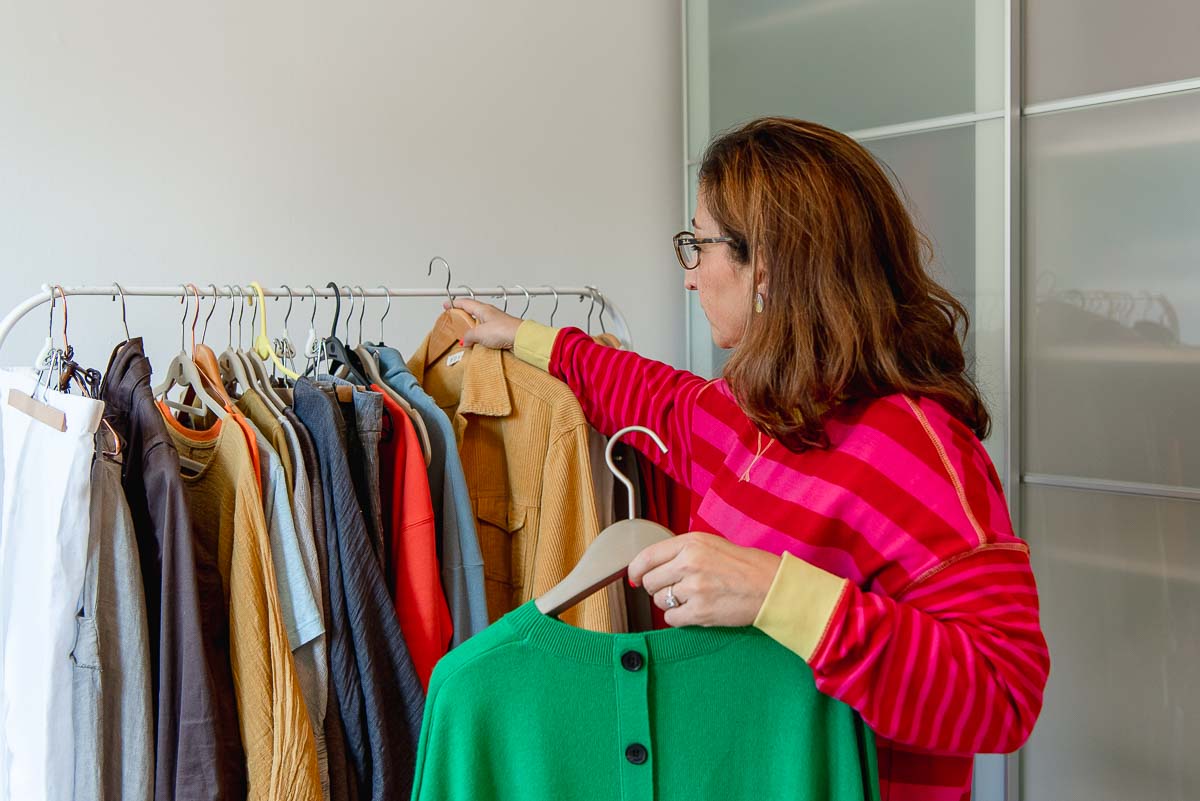
So if your brand colours don’t suit your skin tone, don’t make you feel good, or simply don’t feel like you when you wear them – don’t force it. The goal here is alignment, not discomfort. You can absolutely create visual consistency in other ways, whether that’s through your props, backgrounds, accessories, or the tone of your surroundings.
Your presence matters more than your palette.
I’ve had clients turn up to shoots in completely different colours from their brand identity – deliberately – because they wanted to show a different side of themselves, or just feel more comfortable. And it worked beautifully, because they felt relaxed and in control. That kind of confidence always photographs well.
If you’ve ever had an experience where you felt totally “off” in an outfit, there might be more to it than you realised. There’s even research suggesting that seeing ourselves in mirror image (as we’re used to) can affect how we respond to photos – which might help explain why you sometimes feel ‘off’ in pictures. Plus you might like to read my blog post on "I'm not photogenic - and other lies we tell ourselves".
And if you're starting to rethink what you want your images to say about you, my Visual Content Audit might help you figure out whether your current photography still reflects where your brand is now.
Thinking ahead – evolving your brand palette
Like everything in your business, your brand colours are allowed to evolve. I'm on my third visual brand design now! (Find out how I arrived at this current one in my blog post here: Brand design for small business.)
Maybe your original palette was pulled together quickly in Canva like mine was – a couple of colours you liked at the time, or shades that felt “safe.” But now? Your business has shifted. You’re clearer on your offers, your clients, and your direction. And those colours that once felt fine now feel a bit… rubbish.
That’s completely normal. In fact, it’s a sign of growth.
Sometimes, all you need is a gentle refresh – a richer tone, a simplified scheme, or a more confident visual identity. Other times, it might be a full rebrand. Either way, your brand colours should support the direction you’re headed in, not hold you back.
If you’re working with a brand designer (I highly recommend Karen Bennett of KB Designs here in Scotland), they’ll help you define a palette that reflects your values, tone of voice, and ideal audience.
And once that palette is in place, it’s the perfect time to book a new brand photoshoot. Your photography needs to reflect your brand as it is now, not as it was two years ago. A session like Transcend is ideal if you’re going through a rebrand or stepping into a new chapter, giving you the time, variety, and strategic scope to bring your updated identity to life.
FAQs about wearing your brand colours
How do I know if I should wear my brand colours?
If your brand colours suit your natural colouring and feel like “you,” wear them confidently – they’ll help your visuals feel coherent and recognisable. If they clash with your skin tone or just don’t feel right, don’t force them. The goal is alignment, not suffering for the palette.
For more practical styling advice on when to wear (and when not to wear) your brand colours, read my blog post on What to wear for a brand photoshoot.
What if my brand colours don’t suit me?
You can still include them through props, backdrops, or accessories. A mug, notebook, scarf, or even a location that matches your palette creates cohesion without you turning the shade of your logo.
For examples of how to use props and backgrounds effectively, read my post How to plan a brand photoshoot that actually works for your business.
Do I have to wear my colours head-to-toe?
Definitely not. Head-to-toe brand colour is usually too much (and looks like you’ve joined a cult). Instead, use your main colour as an accent – a jacket, blouse, or accessory – and build the rest of your outfit in complementary neutrals.
For ideas on how to mix subtle colour accents with neutral pieces, have a look at my Ultimate Guide to Brand Photography and Business Headshots in Scotland.
What if my brand colours are very bold or bright?
If your palette includes strong or neon shades, it’s best to use them sparingly. Think accessories, stationery, or background details rather than a full outfit. The camera can exaggerate vivid colours, and the focus should always be you, not the shirt blinding the lens.
You’ll find examples of this in my post Why is professional photography important for your business.
How can I bring brand colours into my shoot without wearing them?
Use your environment. A café interior, a wall, a studio backdrop, or even a plant in your brand shade can work wonders. You can also bring small props – notebooks, mugs, fabrics – that tie your palette together naturally.
For a step-by-step guide on how to use your environment and props strategically, read my article How to use brand photos strategically.
Should I update my photos if my brand colours change?
Yes, because your visuals should always reflect where your business is now, not where it was two years ago. A shift in your brand palette is a good sign of growth – and your imagery should evolve with it.
To see how a rebrand and fresh imagery work together, visit my Transcend brand photography package page.
Something to think about
Your brand colours are more than just decoration. They’re a quiet but strategic part of how you communicate – helping people recognise you, connect with you, and feel more confident about working with you.
When you wear those colours – whether that’s in a photoshoot, on a Zoom call, or at your next networking event – it sends a subtle message that you’re showing up with intention. It shows your audience that you know who you are, what you stand for, and how you want your business to be seen.
But that doesn’t mean you need to stick to them rigidly. Your colours should support you, not restrict you. Use them when they feel good. Adapt them when you need to. And if it’s time for something new? Trust that instinct. You’ll know.
If this post has got you thinking about what your current visuals are saying – or not saying – my Soar brand photography package is designed to give you a purposeful, personality-driven image library that actually fits where you are now. You’ll leave with photos you’re excited to use – and the clarity to know exactly how and where to use them.
Whatever your next step looks like, I hope this has helped you see your brand colours not as a chore, but as a creative and strategic part of how you show up in your business.